Getting Started with Landbot
Introduction to Landbot 🌍
Creating & Setting Up Your Account 👥
How to create your Landbot account, set it up and invite teammates
Common reasons for not receiving account activation email
Trial period
Account Settings
Build Your First Bot 🛠️
Builder Interface Tour
How to build a bot in Landbot
Managing Data in Your Agent: A Guide to Using Fields
Languages and Translations in Landbot
Organize your flow with Bricks
Using Flow Logic in Landbot
How to Test Your Bot - Complete Guide 🧪
How to "debug" (troubleshoot) your bot's flow to spot possible errors (for non coders)
Starting Point
Build it for me!
Launch and Share Your Bot 🚀
Build a bot
Bot's Settings
Bot General Settings
Web bots: Second Visit Settings
Custom System Messages
Hidden Fields (Get params / UTMs from url and use it as variables)
Landbot native SEO & Tracking tools
Typing Emulation (Message Delay)
Messages, Questions and Logic & Technical blocks
Messages
Media Block
Media block
How to display images with a variable URL source
How to embed a .gif file inside a message
Different ways to embed Videos in Landbot
Display video and hide button to continue until video has ended
Send a Message block - Simple Message
Goodbye block
Question blocks
Date Block
Scale Block
Buttons block
Ask for a Name block
Ask for an Email block
Ask a Question block
Ask for a Phone block
Forms block
Multiple-Choice Questions with the Buttons Block
Question: Address block
Question: Autocomplete block
Question: File block
Ask for a Number Block
Question: Picture Choice block
Rating block
Question: URL block
Question: Yes/No block
Logic & Technical blocks
Code Blocks
Dynamic Data
How to Use the Dynamic Data Block in Landbot
Get the array's index of the user selection and extract information from array
Formulas
How to Perform Basic Calculations
Get started with the Formulas block
Formulas - Regex
Formulas - Date
Formulas - String
Formulas - Logical
Formulas - Math
Formulas - Object
Formulas - Comparison
Formulas - Array
Persistent Menu
Trigger Automation
Webhook
Landbot System Fields: Pre-created fields
Set a Field block
Any of the above Output
Global Keywords 🌍
Keyword Jump
Lead Scoring block
Jump To block
How to split bot traffic with the A/B Test block
Conditions block
Conditions block II (with Dates, Usage and Agents variables)
Close Chat block
How to ask a question based on a variable not being set (empty URL params)
Business Hours block
Custom Goals
Inactivity Trigger block
Share & Embed
Redirect Users
How to redirect visitors to a URL (web only)
How to add a Click-to-Call/Email/WhatsApp button
Redirect User Based on Language Input (DeepL)
Generate a URL that has variables from user answers
Popup on Exit Intent
Share
Customized Embed Actions
How to redirect user to another url in your site with Livechat open to continue conversation
How to Detect Visitors Browser
Customize and embed your WhatsApp Widget
Modifying Embed Size
Detect if bot was opened
Customized Behavior in Mobile Browsers
Load script and display bot on click button
Launch Bot On Exit Intent
Display Bot During Business Hours Only (Livechat & Popup)
Open / Close a Web bot (embedded)
Launching a bot depending on browser language
How to pass WordPress logged in user data to Landbot
Set the flow depending on the url path (for embedded landbots)
How to launch a Landbot by clicking a button
Open LiveChat bot as soon as page loads
Detect if a visitor is on Mobile/Tablet or Desktop
Embed
How to embed your agent into your website
Embed Landbot in an iframe
Landbot in Wix
Landbot in your web with Google Tag Manager
Landbot in Webflow
Embed in Sharetribe
Landbot in Shopify
Embedding Landbot in Carrd
Landbot in Wordpress
Landbot in Squarespace
Customizing the Proactive Message
Design section (web bots)
Verification & Security
Validate phone number with SMS verification (with Vonage Verify)
Cookie consent banner (full page / full page embed)
Add Captcha Verification (Non-Embedded Bots)
Bricks
How to disable a bot
Account Settings and Billing
Billing
Privacy and Security
Teammates
Startup Discounts
NGOs and Educational Organizations Discount
AI in Landbot
Landbot AI Agent
AI Agent - Interactive components
AI Agent block
AI Agent Setup - Best Practices
Tips to migrate from old AI Assistants to AI Agents
How to Create Custom Instructions for a Landbot AI Agent
AI Agent In Action - Live Implementation Example
Capture, generate and use data with AI Agents
Structuring your AI Agent Knowledge Base
Custom AI Integrations
Create a JSON format response from OpenAI in WhatsApp
Responses API
Connect OpenAI Assistant with Landbot
AI in WhatsApp
How to build a FAQ chatbot with GPT-3
GPT-4 in Landbot
OpenAI
Prompt Engineering for GPT-3
Build a Customer Service Bot with ChatGPT and Extract Information
Google Gemini in Landbot
Build a Chatbot with DeepSeek
AI Task block Overview
Integrations with Landbot
Native Integrations
Airtable
Airtable integration block
Get data filtered from Airtable with a Brick- Shop example
20 different ways to GET and filter data from Airtable
How to add/update different field types in Airtable (POST, PATCH & PUT)
How to Create, Update, Retrieve and Delete records in Airtable (POST, PATCH, GET & DELETE)
Get more than 100 items from Airtable
Insert Multiple Records to Airtable with a Loop
How to Get an Airtable Token
Advanced filters formulas Airtable block
Airtable usecase: Create an event registration bot with limited availability
Update Multiple Records in Airtable Using a Loop
Reservation bot with Airtable
Calendly
Dialogflow
Dialogflow & Landbot course
Dialogflow & Landbot intro: What is NLP, Dialogflow and what can you do with it?
Dialogflow & Landbot lesson 1: Create your first agent and intent in Dialogflow
Dialogflow & Landbot lesson 2: Get the JSON Key
Dialogflow & Landbot lesson 3: Setting up of Dialogflow in Landbot
Dialogflow & Landbot lesson 4: Training phrases and responses for a FAQ
Dialogflow & Landbot lesson 5: Entities and Landbot variables
Dialogflow & Landbot lesson 6: Redirect user depending on Dialogflow response parameters (intent, entities and more)
Integrations > Dialogflow Block
How to extract parameters from Dialogflow response with Formulas
Dialogflow Integration Dashboard
Dialogflow in Unsupported Languages (& Multilingual)
Dialogflow - How to get JSON Key
Google Sheets
Google Sheets Integration: Insert, Update and Retrieve data
How to use Google Sheets to create a simple verification system for returning visitors
Google Sheets integration (new version)
How to give unique Coupon Codes (with Google Spreadsheets)
How to use Google Spreadsheet as a Content Management System for your bot
HubSpot
MailChimp
Salesforce
Segment
SendGrid
Send an Email
Sendgrid Integration Dashboard
How to create a custom SendGrid email - (Custom "from" email)
Slack
Stripe
Zapier
How to Configure the Landbot and Zapier Integration Using the Zapier Block
Zapier Integration Dashboard
How to insert a row to Google Spreadsheet by Zapier
How to generate a document with PDFMonkey by Zapier
Send WhatsApp Templates from Zapier
How to Send Emails from Your Landbot Using Gmail via Zapier
Get Opt-ins (Contacts) from Facebook Leads using Zapier
How to extract data from an external source with Zapier and use it in Landbot
Zapier trigger
How to complete a digital signature flow by Zapier
Make a survey with Landbot and display the results in a Notion table using Zapier
Custom Integrations
ActiveCampaign
Google Calendar
Google Fonts
Google Maps
Embed Google Maps
Google Maps API Key for Address block
Extract Data With Google Maps Geocoding API
Calculate Distances With Google Maps API
Google Meet
IFTTT
Integrately
Intercom
Make
Connecting MySQL with Make.com (formerly Integromat)
Send WhatsApp Message Template from Make
Make Integration With Trigger Automation Block
How to send an email through Sendinblue by Make.com (formerly Integromat)
Get Opt-ins (Contacts) from Facebook Leads using Make
How to extract data from an external source with Make.com and use it in Landbot
OCR
Pabbly
Paragon
Pipedream
PDF Monkey
Store Locator Widgets
Xano
Zendesk
Send an Email with Brevo
Shopify in Landbot: Get Order Information
Send Leads to Zoho CRM
Landbot + n8n Integration: How to Connect Using the n8n Block
How to Integrate Landbot with n8n using Webhooks
WhatsApp Channel
Getting started!
WhatsApp Testing
Build a WhatsApp Bot - Best Practices and User guide
Build a WhatsApp Bot - Best Practices for Developers
Types of Content and Media you can use in WhatsApp 🖼
1. WhatsApp Article Directory
WhatsApp Integration & Pricing FAQ
Adding & Managing your WhatsApp Channel
Meta Business Verification - Best Practices 🇬🇧
WhatsApp Number Deletion (WA Channel management)
Adding a WhatsApp number to your account
WhatsApp’s Messaging Policy: New Accepted Industry verticals
Meta processes guide: Meta Business Verification, Official Business Account (OBA) requests, Appeals
Existing WhatsApp Number Migration
Key Insights for Migrating to WhatsApp Business API Cloud
How to's, Compatibility & Workarounds
WhatsApp bots - Feature Compatibility Guide
WhatsApp: Show a Different Flow on Return Visits
WhatsApp - Get user out of error message loop
How to do Meta ads conversion tracking in WhatsApp bot using the Conversion API
Getting Subscribers: Opt-in, Contacts
How to get Opt-ins (Contacts) for your WhatsApp 🚀
WhatsApp Quality Rating and Message Delivery
Opt-In/out block for WhatsApp 🚀
Opt-in Check Block
Contact Subscribe Block: Manage Opt-ins and Audiences
New Contacts: Import, Segment, and Organize Easily
WhatsApp Channel Settings
Parent Bot/Linked Bot - Add a main bot to your WhatsApp number
WhatsApp Channel Panel (Settings)
Growth Tools for WhatsApp
Messaging and contacting your users
WhatsApp Campaigns 💌
WhatsApp's Message Templates
Audience block
WhatsApp Marketing Playbook: Best Practices for Leadgen
WhatsApp Error Logs: Troubleshooting guide
Audiences
WhatsApp for Devs
How to calculate the number of days between two selected dates (WhatsApp)
Creating a Loop in WhatsApp
Recognise the users input when sending a Message Template with buttons
Trigger Event if User Abandons Chat
Calculate Distances in WhatsApp
Send Automated Message Templates based on Dates
How to Let Users Opt-Out of Your WhatsApp Messages via API
reply from Slack: How to create an integration to allow agents reply WhatsApp users from Slack (with Node JS)
Set Up a Delay Timer in Bot
Notify Teammates of Chat via WhatsApp
Native blocks for WhatsApp
Other Channels - Messenger and APIChat
Facebook Messenger
The Facebook Messenger Ultimate Guide
Types of content you can use in Messenger bots 🖼
How to Preview a Messenger bot
API Chat (for Developers)
Human Takeover & Inbox
Metrics and Data Management
For Developers & Designers
JavaScript and CSS
CSS and Design Customizations
Design Customizations
Advanced (Custom CSS & Custom JS)
Components CSS Library Index
Background Class CSS
Identify Blocks CSS
Buttons Class CSS
Header Class CSS
Media Class CSS
Message Bubble Class CSS
Miscellaneous Classes CSS
CSS Customization Examples: "Back to School" Theme
Get started guide for CSS Design in Landbot
CSS Customization Examples: Call To Action: WhatsApp
CSS Examples: Lead Gen
CSS Customization Examples: "Translucid"
CSS Customization Examples: "Minimalist" Theme
Dynamic Data CSS
Form Block CSS
CSS for Typewriter Effect
CSS Customization Examples: Carrd Embed Beginner
Dynamically Change a Bot's Background
Proactive Message Customizations with Javascript and CSS
Landbot v3 - Web CSS - RTL
CSS Customization Examples: Video Bubble
Dynamically Change Any Style
CSS Customization Examples: CV Template
Change Landbot custom CSS dynamically from parent page onload
Widget/Bubble Customizations with Javascript and CSS
JavaScript
How to change Avatar dynamically
Javascript in WhatsApp
Landbot JavaScript Integration
Different ways to format numbers with JS
How to display an HTML Table and a List in Landbot v3 web
Trigger a Global Keyword with JS (web v3)
Create Dynamic Shopping Cart with JS and CSS
Add a Chart (with Chart JS library) in your Landbot
Different ways to format numbers with JS (WhatsApp)
Pop up modal to embed third party elements
Landbot API
Send WhatsApp Messages with Landbot API
How to "send" a user to a specific point in the flow with Javascript and with the API
APIs
Get Opt-ins (Contacts) using Landbot API
MessageHooks - Landbot Webhooks
Resume flow based on external process with Landbot API (Request, Set, Go)
Tracking
Google Analytics - Track Events (Not embedded)
Google Analytics - Track Events (Embedded)
Meta Pixel - Track Events (only Embedded)
How Track Google Analytics Events in Landbot with Google Tag Manager (GTM)
Google Adwords - How to track Google Adwords in Landbot
Set a timer to get the time spent during the flow
Workarounds and How To's
Workflows
How to build an event registration Landbot (to be used in one screen by many attendees) (web only)
How to let user select a time of booking (with a minimum 45 minutes notice)
Send Files Hosted in Landbot to Your Google Drive with Make
Two-Step Email Verification
Fixing Web Bot Loading Issues for iOS Devices in Meta Campaigns with Disclaimers
Progress Bar Workaround
Skip Welcome Message
How to Add User Verification to Your Chatbot
How to set up questions with a countdown
HTML Template for Emails
Creating a Simple Cart in WhatsApp
Creating Masks for User Input (2 examples)
More Topics
Landbot MCP and Plugin
What are the Landbot MCP and the Landbot Plugin?
How to build, test and publish an agent with the Landbot MCP or the Landbot Plugin
How to fix common problems with the Landbot MCP and the Landbot Plugin
How to get started with the Landbot Plugin
How to style your Landbot web chat with the Landbot Plugin or the Landbot MCP
How to get started with the Landbot MCP
Table of Contents
- All Categories
- Build a bot
- Design section (web bots)
- Design Section Guide 🎨
Design Section Guide 🎨
 Updated
by Jonathan Goodfellow
Updated
by Jonathan Goodfellow
Prefer watching than reading? No problem, we've got you covered 👇
🥳 Welcome to the new Design section, where you can customize your Landbot to make it unique 🤩
To access this section, all you need to do is click the Design button in the top menu of your builder
🎉 Let's start:
Design Templates (pick a predefined design)
In this section you can select the template you like the most and use it in your bot: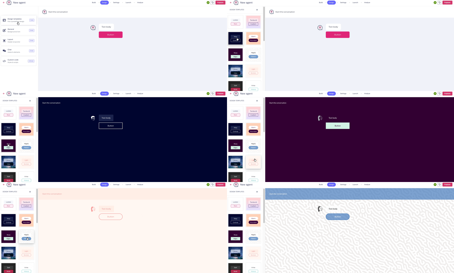
General - Font and Background
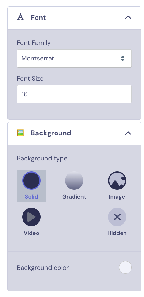
In the General section you can choose the Font Style and Size for the text in your Agent, and the background colour and style.
If you choose to add an Image to use as your background, you can select different images to display when the Agent is accessed on Desktop and Mobile:
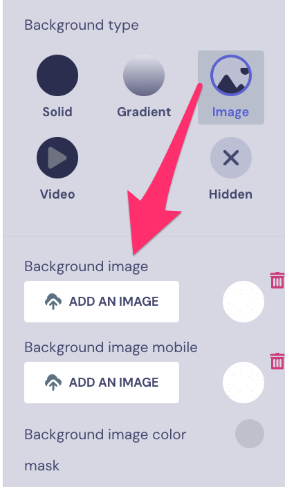
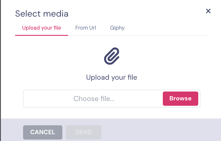
You can choose between uploading a file, adding a URL where the image is hosted or selecting from Giphy.
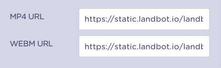
If you choose to add you own Video you must create an mp4 and Webm version:
Hidden option
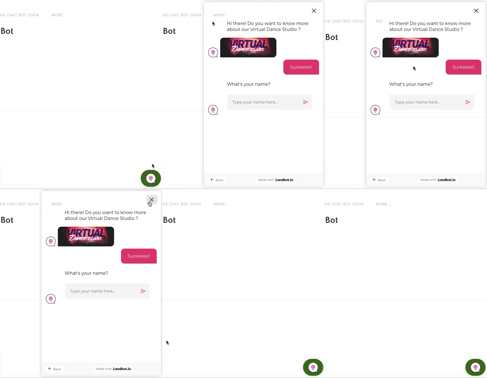
If you select this, your background will be transparent. This is useful for embedded bots, to make sure that the background of your page shows behind. 💪🏽
Layout - Header and Launcher Icon
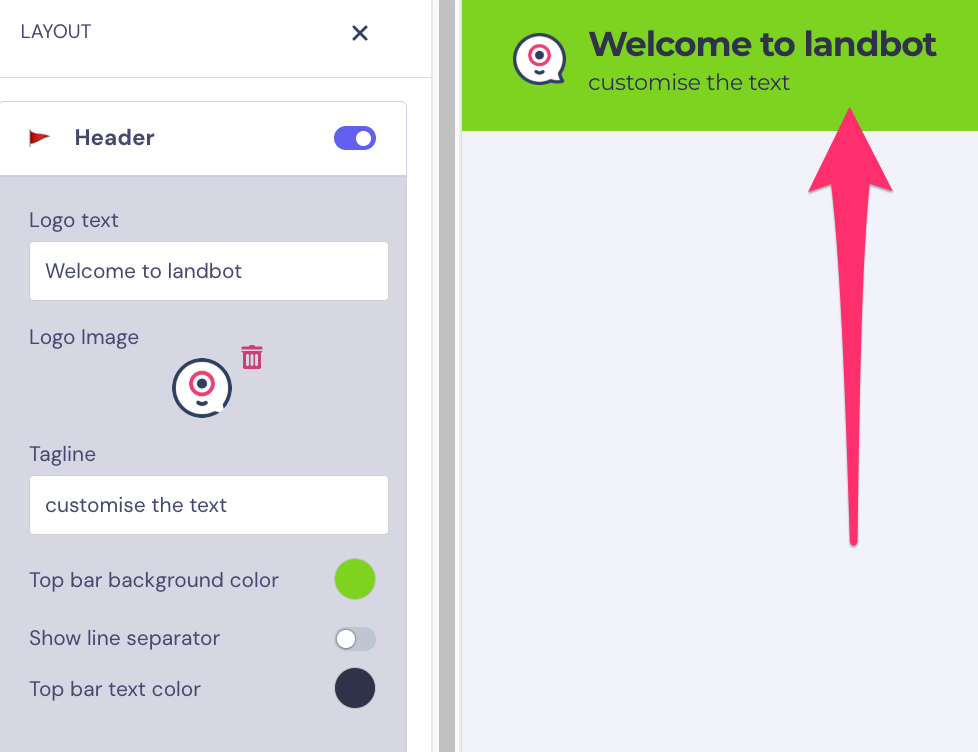
In the Header section you can trigger the Header to display or not, set the Logo Text, Logo Image and Tagline, set the Background and Text Colour, and turn on or off the Line separator display:
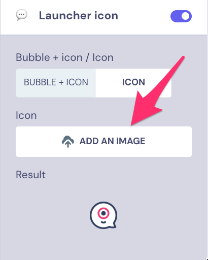
The Launcher Icon is the icon that will display when you embed your agent in your Website.
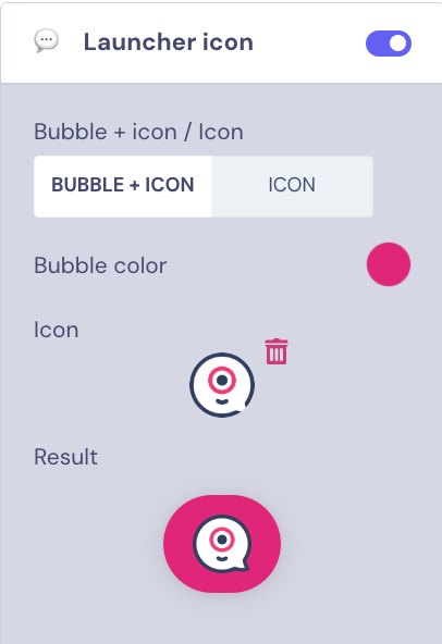
Here you can choose whether the Icon is highlighted by a Bubble and select the colour, and choose your own Icon image:
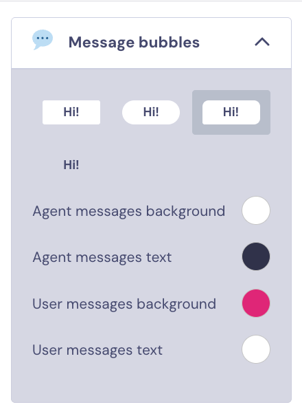
Chat - Avatar & Elements 💬
Here you can choose the shape of bot's and user's messages, as well as customize:
- Agent messages background
- Agent messages text
- User messages background
- User message text
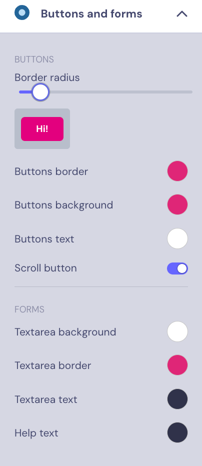
Buttons and forms 🔘
You can easily set the border radius for your buttons and customize the color of:
- Buttons border
- Buttons background
- Buttons text
You can also customize the color of the text area background, border, and text for Forms.
Finally, you can customize the Agent Avatar by adding your own image or selecting from the options available.
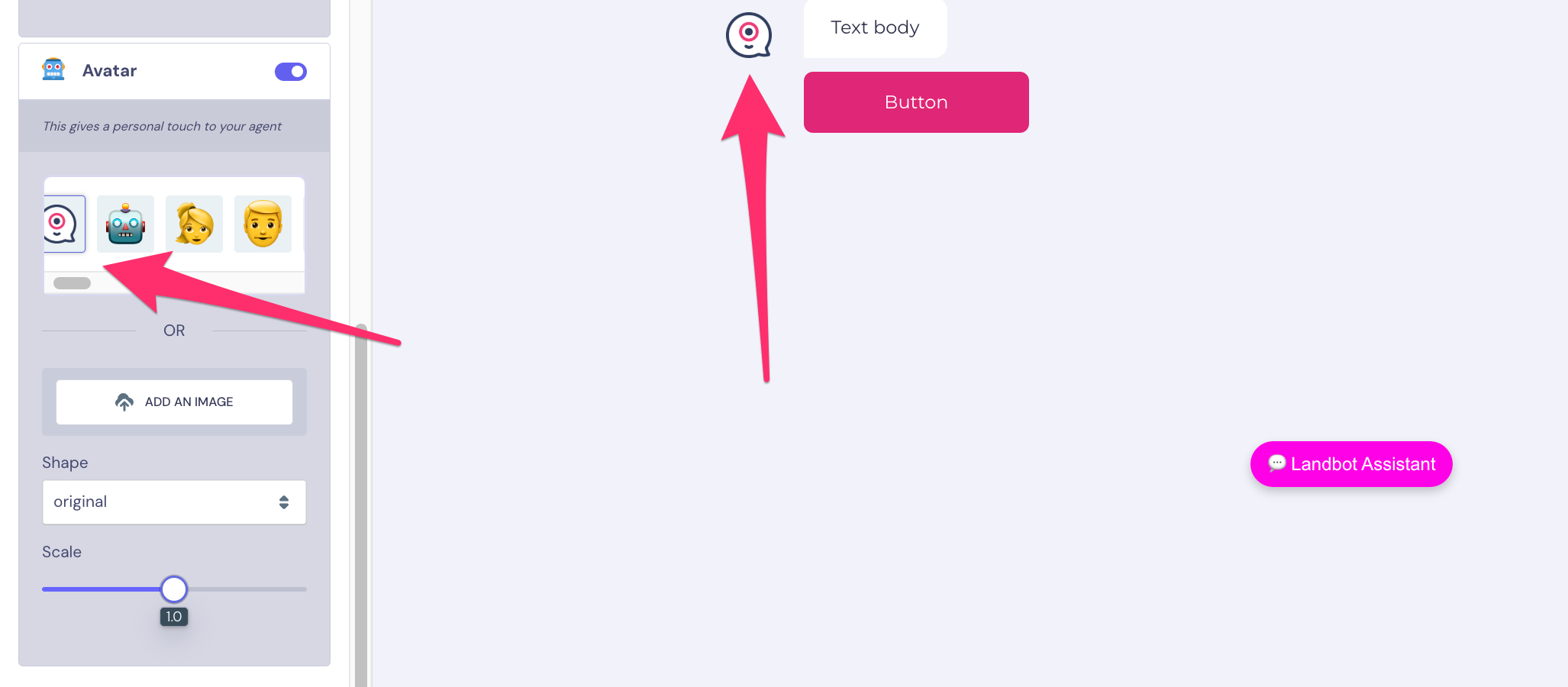
👆🏻You can find all the information about customizing this section by clicking on our Icons & Logo article 🤓
Custom code 💻
You can customize your Agent with CSS and JS:
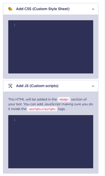
👆🏻For a full guide to using CSS and JS to customize your account, please check out our article: Advanced (Custom CSS & Custom JS) article 🤓
Design Tips 🎨
😎 Here are some tips about the Design section that will be really useful for you:
- Real-time changes. Every change you make using the left menu will be shown in real-time on the right side of the screen. So, if you're making some changes using, let's say, the Custom Style editor, and you notice no changes, something might be going wrong!
- Saving. The app will auto-save your changes every time you move from one section to another to make sure you don't lose any edits, so keep that in mind.
- Preview. The right side of the screen contains a fully interactive Landbot so you don't need to click preview to test the flow along with the design edits.
For WhatsApp
This Section is not compatible with WhatsApp bots.
For Facebook Messenger
This Section is not compatible with Messenger bots.